Functional Design at Miel
A guide to designing a brewery on a shoestring budget with Owner and Creative Director Janice Montoya.
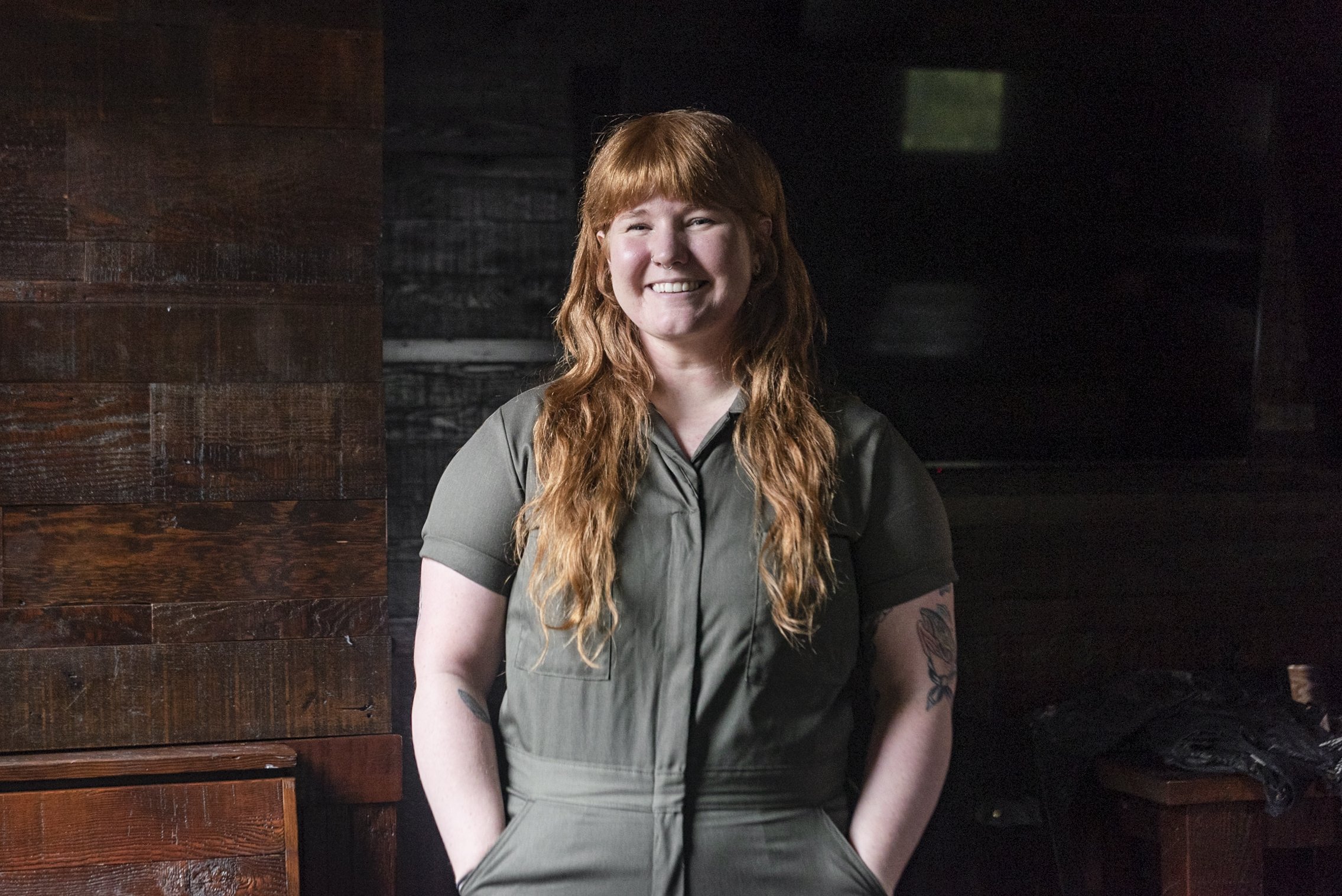
At Miel Brewery & Taproom, everything will forever be a work in progress. And Owners Janice Montoya and Alex Peyroux are proud of that. After opening their brewery on a shoestring budget, they’ve learned to prioritize what is absolutely necessary to keep the guests coming. “Alex was like, ‘all we need is good beer, tables, and seating,’” says Montoya, who plays double duty as creative director. “It’s weird to say, but that’s kind of all we had when we opened. In the beginning, it was a little frustrating, looking at a vision board and at the same time not having the funds to make it what we wanted to.”
Owners Janice Montoya and Alex Peyroux
Photos: Rae Serra
Montoya had no prior experience as a professional designer, but she flexed similar muscles as a videographer and digital producer. “When Alex and I sat down to start planning Miel, I immediately jumped into that same way of thinking,” she says. “I was excited to have this vision of how we wanted our taproom to come to life.” That vision—that specific energy that they wanted Miel to represent, naturally fell into place. Montoya and Peyroux (the brewer of the duo) found a space in the Irish Channel neighborhood. “We were immediately like, this is it.” It was the right neighborhood, the perfect size, and had an industrial vibe that they felt like they could polish up and make their own.
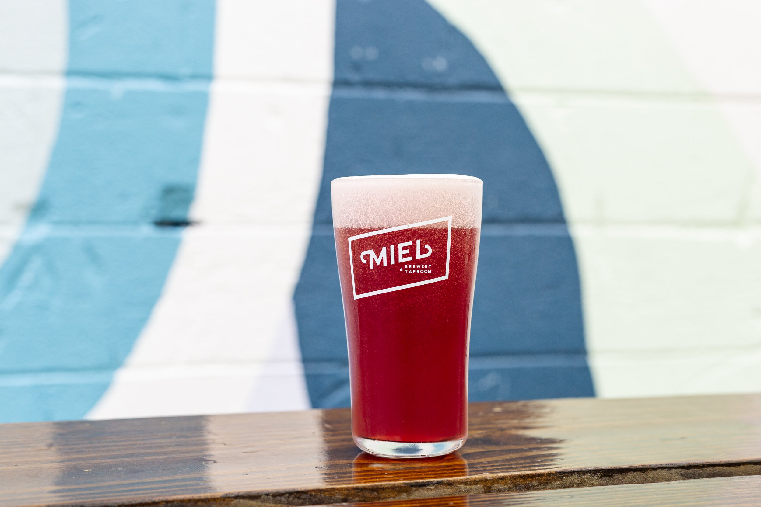
Next came the logo. “I wanted it to be clean but still recognizable,” says Montoya. “I feel like I’ve always been drawn to diagonal fonts. The flourishes reminded me of, in some sense, traditional Hispanic flourishes.” It took more time for her to land on the brand colors. She narrowed it down to a color palette of eight, ranging from deep teal to lavender. “Using those colors and the space, we started looking for materials for tables—figuring out the balance of that clean look but also not overly colorful.
They opened Miel in 2018, concentrating on their beer, first and foremost. “The space can be inviting or look nice, but we strive to make a good product. That’s the main takeaway,” says Montoya. Most of the shelves, tables, and decorative items were either thrifted or hand-made. But as they gained their footing, Montoya and Peyroux were gradually able to make updates. The wobbly shelves that the couple built themselves were replaced with sturdy, professionally contracted planks of wood. They hired a local artist, Anna Koeferl, to paint a mural on the wall of their outdoor patio. Montoya continued to bring in vintage, nostalgic touches meant for both decorative and recreational use, like Peyroux’s childhood ping pong table and Nintendo 64. “Now, four years into it, I’m happy I’ve been involved in putting together the space,” says Montoya. “We were able to make purchases and buy things based on how people were interacting. If we had rushed to open, we would have gotten it wrong. It feels like the space is what we envisioned.”
The back patio at Miel is stocked with picnic tables, ping pong, and dangling disco balls. Montoya and Peyroux had planned on hosting their wedding at Miel and having their first dance in the beer garden, so they hung a disco ball to up the romance. The wedding had to be delayed due to the COVID-19 pandemic, but the disco ball remained. When they finally had their wedding reception, they added more —a makeshift disco chandelier.
“Alex has a microbiology degree. I’m so much more visual,” says Montoya. “Displaying the beer in beakers is the perfect combination of us both.” The beakers represent the science behind the beer, while creating a visual for what it looks like when it’s poured. “It took us two years to open and that was one of the first things we ordered.”
Montoya always planned to fill the space with plants—something that reminds her of her childhood in Honduras. “It was something I was used to seeing in my grandparents house,” she says. “Plants can really make a space inviting. The more plants, the more we could polish up this industrial look.” For the layout of both the indoor and outdoor space, Peyroux focused on the technical part of the experience—how big the bar should be, how much seating they should have, what type of steel is durable in the rain. “We worked really well together in piecing together the functionality and design.”
Janice Montoya’s Dos and Don’ts of Design
Do:
Ask for advice! Our architect was a good friend and had a wealth of knowledge on finishes that would work for a commercial space.
Find your local millwork/fabricator. We bought really inexpensive used table bases and had a local millwork shop make us custom tabletops.
Make a list of what you'd like to splurge on (for us it was custom color bar stools) and work your budget around that. We sourced used dining chairs that we refinished ourselves in order to afford the custom stools.
Don’t:
Get frustrated or overwhelmed with costs. I made a list of what we absolutely needed to open and everything else was brought in or DIY'd when we had the budget.
Don't rush. At the time I wasn't ecstatic about opening without a fully decorated place, but very quickly, we learned how people were interacting with the space and replanned accordingly.
Don't be afraid to add your own personality! We have Alex's childhood ping pong table in the beer garden and artwork from where my family is from, Honduras. It makes for a unique space.


